Number Picker - Form Element
Last updated: July 8, 2026
The Number Picker presents to the participant a visual, easy to use method for selecting a number from zero to ten.
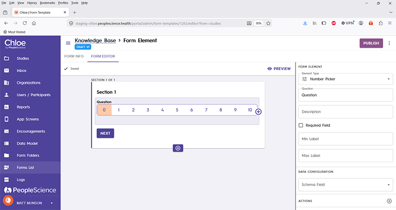
Question | The primary text displayed for this element. Bold by default. |
Description | Secondary text for this element type. Displayed beneath the "Question" text. Not bold. |
Required Field | Check this to require participant input. The section will not allow the user to advance until they input something into this element's field. |
Min label | Text to be displayed on screen to the left hand side of the scale. |
Max label | Text to be displayed on screen to the right hand side of the scale. |
Schema Field | |
Actions | |
Layout | |
Delete form element |
For an introduction to Form Elements, a complete list of them and articles on how to use them, please visit this article: 📄 Form Elements