Form Elements
Last updated: July 8, 2026
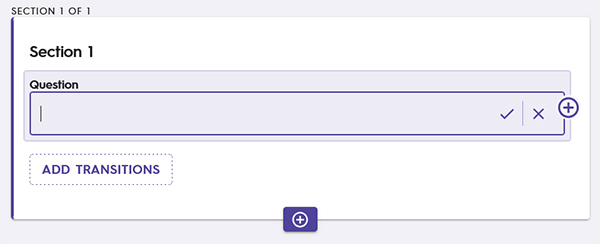
A vital component to form building is the use of form elements, special components that can communicate, collect, and organize data. Form elements are added to a Form Section by clicking the "Add Form Element" button.

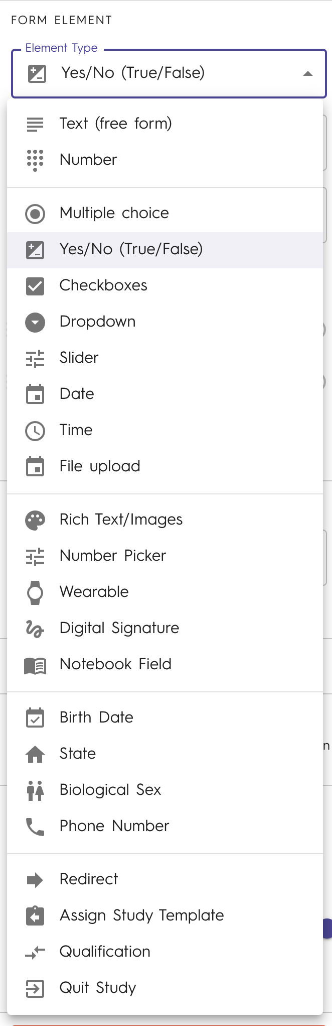
When you create a Form Element, it's default type is "Text (free form)." To change to a different type, select the newly created Form Element to activate the configuration pane on the right hand side of the screen.
Select from the drop-down list on the right hand side configuration pane which element you wish to use.
Protip: A Form Section can have multiple Form Elements.
Once you have selected the desired Form Element type, the next step is to configure it. Use the links to the articles below for detailed instructions on how to use and configure Form Elements.
📄 Text (free form) - Form Element
📄 Multiple Choice - Form Element
📄 Yes/No (True/False) - Form Element
📄 Rich Text/Images - Form Element
📄 Number Picker - Form Element
📄 Digital Signature - Form Element
📄 Notebook Field - Form Element
📄 Biological Sex - Form Element
📄 Assign Study Template - Form Element
📄 Participant Status Change - Form Element
📄 Qualification - Form Element
For an overview of Schema Fields and how form results look exported click here.
Protip: At least one Form Element is required per Form Section. You may notice the "Delete Form Element" is deactivated on a section with only one form. If you have more than one Element in a Section, you can delete one by selecting it then pressing the "Delete Form Element" button on the Form Element configuration pane.
All forms should use a redirect, an automation form element that allows users to return to their previous screen after completing the form.