Checkboxes - Form Element
Last updated: July 8, 2026
The Checkboxes form element allows the participant to choose more than one response from the list provided. Building a checkboxes element is very similar to the process of building a Multiple Choice element.
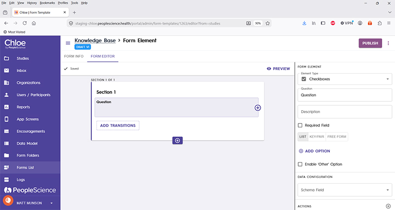
Check boxes and their associated text are added to the form Element by using the "Add Option" button, or manually editing in the "Key/Pair" or "Free Form" sections. You can explicitly decide what text is to be shown to the participant, and optionally save different information to the database, such as an integer value or an index.
This video provides a brief tutorial on how to configure this element type.
Question | The primary text displayed for this element. Bold by default. |
Description | Secondary text for this element type. Displayed beneath the "Question" text. Not bold. |
Required Field | Check this to require participant input. The section will not allow the user to advance until they input something into this element's field. |
List | Select to display the question line items in list form, showing only the text to be displayed in the questionnaire. |
Key/Pair | Select to display the question line items in keypair form, displaying the value to be saved as study data along with the text to be displayed. Note: these two values can be different. eg a numeric key mapped to text. |
Free Form | Displays the line items in free text keypair form, with the database value separated from display text by a bar, or the "|" character. |
+Add Option | For manually adding items to the list of response items to be displayed. |
Enable 'Other' Option | Check to add an "other" field to the list of responses, with a blank text field available for user input. Enabling this option requires you to create a separate schema field to store this data. |
Schema Field | |
Actions | |
Layout | |
Delete Form Element |
For an introduction to Form Elements, a complete list of them and articles on how to use them, please visit this article: 📄 Form Elements