Number - Form Element
Last updated: July 8, 2026
The Number form element can be used to display or collect numeric characters, eg 1,2,3,4, 256 etc.
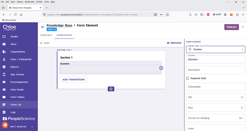
The configuration pane for this element type includes the following options:
Question | The primary text displayed for this element. Bold by default. |
Description | Secondary text for this element type. Displayed beneath the "Question" text. Not bold. |
Required Field | Check this to require participant input. The section will not allow the user to advance until they input something into this element's field. |
Placeholder | Text that can be displayed within the text box. You can give your participant some example answers, or offer guidance. |
Min | The minimum allowable value a participant can input. |
Max | The maximum allowable value a participant can input. |
Format for Masking | |
Prefix | |
Suffix | |
Allow Leading Zero | |
Thousand Separator | |
Data Type | |
Schema Field | |
Actions | |
Layout | |
Delete Form Element |
For an introduction to Form Elements, a complete list of them and articles on how to use them, please visit this article: 📄 Form Elements